
The pearlescent shades offer a kaleidoscopic effect, the illusion of changing color depending on the direction of light (note this statement; it's important). The colors are never what they seem; each movement creates a new nuance of color. From gold to red, violet to pink, blue to green, aqua blue to violet, their holographic effects span the color spectrum.
Eyes to Kill Intense is not new, so I'm sure you're familiar with it. Its innovative hybrid texture, which is not a powder nor a cream, provides a smooth, lasting color film to the eyelids. Each shade is intensified with a second pigment for a multidimensional effect. In just one swoop, you can create a wet, shimmering smoky eye. Use more for serious drama.

I started trying to take swatch photos of Gold Hercule in full sunlight outdoors. I knew I wasn't getting getting good photos because the shadow, once applied to my arm with a sponge-tipped applicator, looked too silvery, too blue, too something - not at all like it looked inside or in the pot. Perhaps this manifestation is only one of many shades in its kaleidoscope of colors?

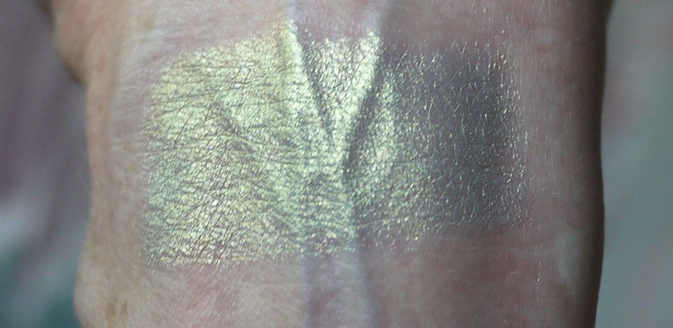
I'll admit I haven't worn Gold Hercule to an evening event, so I have no idea what it might look like in candlelight or dim light. I do know how it looks in strong daylight outdoors and in. I'm fascinated by it.
The new Kaleidoscope Collection is available at all Giorgio Armani Beauty counters. It is online at the Giorgio Armani Beauty Web site and other online sites.
Photo at top courtesy of Giorgio Armani Beauty; other photos by Best Things in Beauty


13 comments:
You just sold me on this color! I was only going to get the pinkish one, but you've made this look so gorgeous and much more wearable than other swatches. Cosmetics companies should pay you a commission!
Wow, I need this in my life! That's gorgeous!
I purchased #30 Rose Popillia from this collection-I think you would love it-it is such a beautiful daytime shade. I can never pull off pink or rose eyeshadows but this also turns grey/silver, slightly green and gold depending on how the light hits it. I'm thinking of buying a backup because as I understand it these are limited edition, but I wonder-will this eyeshadow formula last unopened in a drawer for a year or more? My eyeshadow collection is comprised of mostly bronze and gold shades, this is a nice change for me!
CGirl, I would love to have that commission. More money to spend on makeup!
It is exceptional, Makeupandentropy!
Jessigreer, it should last, but no guarantees with creams. Put it away without ever opening. Actually, wrap it in aluminum foil or Saran Wrap if you don't have any Parafilm.
Hi Charlestongirl, What a gorgeous chameleon of a shade! Gold Hercule is gorgeous :)
Wow, this is what I wish Chameleon from LMdB would be, this is stunning!! And a feat of photography on your part, CG, to show the total transformation of color depending on the angle. Brilliant!
I've been seeing swatches of this collection around the net, and frankly I don't think there's a dud in the whole lot. Each and every shade is stunning!
Oh I want thia badly
This is very beautiful, I'm so glad you shared it with us. And I'm especially glad you swatched it for us, because when I first saw it in the pot I thought I wouldn't like it very much, but it's lovely. :-) I can't remember if you've said before or not, but is this at all similar to the Buxom Stay There shadows, or completely different?
Thanks for this post! :-)
That duochrome is gorgeous but greens like that never look good on me...
Gorgeous shade
Post a Comment