How I love an ultra-thin line at my lashes! Lancôme's Artliner Waterproof Precision Point Eyeliner ($29.50) for Summer 2012 was designed to give me a fine line - as thin as it gets. This liner was introduced in three shades: Gold Passion, Bronze Desire, and Pink Luxe. I selected Gold Passion. I think the color will surprise you, but first...
Emphasize your eyes with this easy-to-handle, liquid pen featuring a
uniquely shaped foam tip that lets you line, shape, and define eyes to
create any look you like. Rich, deep, luminous pigments offer the most
intense, dramatic color you can apply. Glides on smoothly without scratching, tugging,
or skipping on the lids and lasts all day.
You can easily use Lancôme Artliner to draw the finest line imaginable. I love the applicator. That drew me to Gold Passion (#103), but the color also captured me.
I took a few swatch photos in full, late-afternoon sun. Instead of applying a thin line, I swiped on the liner multiple times to create a large swatch to show you this amazing color. It's a bronze, brown, gold hybrid. It is semi-metallic, but not overly showy at the lash line. It's also waterproof, good for all of you who have trouble with oily lids in the summer.
Is there anyone who can't wear this color? Is there anyone who wouldn't love to have it? Look at how powerful it is! If you are looking for an alternative to black - one with pizazz, this is it.
Lancôme suggests you apply it for a rich, metallic gold or bronze effect. Trace the upper lash line to add a pop to the eye and “break-up” the darkness of the smoky eye or a bright color for a
daytime look.
I think this eyeliner was the sleeper of Lancôme's summer collection, and the good news is that it's still available at many Lancôme counters. The summer Artliners were available two days ago at the Lancôme Web site, but today it appears that the weird Pink Luxe is the only color for sale. I'm very curious about the two-day sell-through. Ask at your favorite counter.
Photo at top courtesy of Lancôme; other photos by Best Things in Beauty
Showing posts with label Summer 2012. Show all posts
Thursday, August 30, 2012
Monday, July 9, 2012
Le Métier de Beauté Pallid Incandescents Kaleidoscope Eye Kit
Before I got to the Kaleidoscope when it arrived, I had fun with the box, shown below and autographed by our friend, Dustin. That extra touch is always sweet.
My photo of the color trays at the top of this feature was taken with clouds. You can even see them in the top of the Kaleidoscope. I wish my photo were brighter, but now that I've used the colors, I can't take another "virgin" photo.
The colors, from top to bottom are Flush, a matte, buttery pink; Lambent, a gleaming turquoise; Refulgent, matte/satin coral; and Ultraviolet, a gleaming lilac. It should be clear that none of them are duplicates from prior Kaleidoscopes. Dustin made sure of that.
I was able to take my swatch photos in full sun. I swatched each shade, top to bottom, using a sponge-tipped applicator. You can see the matte pink at the top of my arm. It's pinker than I am, so it's visible. It's a great base shade.
The green and lilac colors are almost incandescent - hence the name, I'm sure. They pop on the skin. Both pastels (all shades, actually) are applied heavily in my swatch photos, but you can apply these colors with a brush and a light touch and achieve a pastel wash of color with ease. They are very pretty for summer. If you're tan, they will flatter you enormously.
The matte coral or peach isn't my best shade, but I can wear it applied lightly with a brush - or layered with the pink. Dustin recommends you wear Pallid Incandescents using Le Métier de Beauté's couches de couleur layering technique to give a soft lavender hue or used in reverse order to achieve a more vidid look. "I really want to encourage color placement with four great shades that can be used together or alone," Dustin said. He also said he wanted to encourage us to play with color, using one, two, three or all four shades - however we please - rather than layering - to achieve a pretty popping look.
I am sorry to show you something that's officially sold out. However, if you want Pallid Incandescents, call Dustin at (212) 872-8612 and ask to be put on a waiting list. Tell him Charlestongirl encouraged you. You never know how things will work out.
Photos by Best Things in Beauty
Saturday, July 7, 2012
Lancôme Color Design Hydra-Balm Summer 2012 Tinted Hydrating Lipbalm SPF 15
A few months ago, in the spring, Lancôme's Bronze Diva summer display started to appear at the counters. At each store, from Saks to Neiman Marcus, Nordstrom to Macy's, there was a glaring absence. The slots for Color Design Hydra-Balm ($22) were empty.
I was disappointed. I knew from the name that it would be a hydrating tinted balm, and I wanted it, by golly. One after another, the Lancôme reps explained to me that they had no idea what had happened to it, why it had never been delivered to them. The collection did ship to them in phases, but the Hydra-Balm was missing in action.
For some reason - not Hydra-Balm - I went off to Lancôme's Web site recently (before I lost my Internet connection), and there it was. I couldn't believe it. The coveted product was right there, in three shades. Perhaps it had been all along? I don't know, but I snapped up two shades faster than you an say shopping cart.
These new, limited-edition super-hydrating lip balms enhance the lips with a tint of popping, fresh, sheer color. You an summer-pamper your lips with long-lasting comfort with this shine-boosting balm that smoothes on deep replenishing moisture, along with a veil of SPF 15 sun protection.
Summer is a time for bright lip colors, but for me, they must be sheer. I don't want a lot of color on my lips when I'm hot. I do want some protection. Color Design Hydra-Balm suits me perfectly.
I took these photos on a blazing hot day. You can see the lip colors sweating. So was I. Lotus Blossom (#559) is shown at left, and Cactus Flower (#561) is shown at right. I knew they would be sheer and gorgeous, so the color in the tube of Cactus Flower didn't give me pause. There is a third shade, Desert Primrose, but it appears to be super-light.
I took them inside, put them in the refrigerator for a few minutes to let them cool off, then swatched, with Lotus Blossom at the top of my arm and Cactus Flower below. Both are sheer and offer a tint of color.
One pink, one peach, they will be perfect companions for me as we continue to sit out this heat wave. Today, the temperatures are predicted to be somewhere between 100 and 104. I'll be wearing one of these, trying to stay comfy.
I don't know whether they ever appeared at the department stores, but you can find them at the Lancôme Web site.
Photo at top courtesy of Lancôme; other photos by Best Things in Beauty
Labels:
Charlestongirl,
Lancôme,
Lip Balm,
Lip Color,
Summer 2012
Monday, July 2, 2012
Route des Indes de Chanel from the Bombay Express de Chanel Collection for Summer 2012
Chanel's Routes des Indes de Chanel ($80) from the Bombay Express de Chanel Collection for Summer 2012 is a stunner. It's much nicer than many of the other Chanel gold highlighters I've purchased in recent years.
This golden powder highlights cheekbones and eyelids with an iridescent touch. An embossed motif recreates the brocade pattern from an Indian-inspired collection created by Gabrielle Chanel in the 1960s. It comes with its own brush, but you will get a better application with your own. Of course, the brush has its own little velveteen pouch.
I took my swatch photos in full, morning sun. I applied the highlighter heavily at the top of my arm with a sponge-tipped applicator. I used a dense blush brush to apply the larger swatch below.
I love the color and shine of this gold! It applies evenly with no effort, and it has real color - unlike some other gold highlighting powders I have. I think it was a good purchase.
This has been a difficult feature to post, but I really wanted to show you Route des Indes. Now, I'd love to go over and help restore power to Verizon. I'll write up my adventures as soon as I get my Internet connection back.
Photos by Best Things in Beauty
Labels:
Chanel,
Charlestongirl,
Highlighter,
Summer 2012
Friday, June 29, 2012
Chanel Joues Contraste Powder Blush in Brume d'Or from the Bombay Express de Chanel Collection for Summer 2012
Bombay Express de Chanel is a lavish, limited-edition makeup collection that was inspired by an opulent vision of India. Each year, the Chanel Métiers d’Art fashion show celebrates the exceptional talent of the Métiers Houses, pairing their expertise with a select destination. This year, Bombay Express de Chanel showcases a specific vision of India - the lavish, luxurious one. The Creative Director of Chanel Makeup, Peter Philips, has intensified the shades of iconic Indian makeup to give it a character that will appeal to many.
Brume d'Or Joues Contraste Powder Blush ($43) is a sunny earth tone that will flatter your cheeks with a warm glow. I ordered my Bombay Express pieces from Chanel.com, and I relied on Chanel's photo above to select the shade. It's actually a different color - much more brown and less rose, and much darker than I expected.
It's a nice brown shade - one that I can wear as a bronzer on my very fair skin - or a neutral blush. For my swatch photos, I applied it very heavily with a sponge-tipped applicator at the top of my arm, and I used a dense blush brush for the larger swatch below. I took my photos in full, morning sun.
I can see some rose in the shade, but not much. Brume d'Or will be most loved, I think, by gals with warm-toned skin. It has a slight shimmer. I haven't used it enough to know if that shimmer is an overspray.
When I apply it, I have to ease up on the brush and apply it extremely lightly. It does warm up my complexion, a goal of many makeup artists. Is it the best Chanel blush for me - or even one of the best? No, but I'm glad to have it, even if it's only for its retrospective value (the makeup museum is getting full!).
I know you will look at these photos and think it's orange (brown + red). It's not orange when applied properly, but it's definitely a warm brown. Chanel suggests you wear it with Rouge Coco Shine, no doubt to leave the emphasis on the face, not the lips. I do love seeing it with my new Shade #73, Chic.
Today, you can order it from the Chanel Web site. At one point, the Chanel Boutiques told me they expected it, but no one has called me. They are usually pretty good about that, so I'm not sure what's up with the boutiques.
I purchased Routes des Indes de Chanel Illuminating Powder and will show you the shimmering gold later today. It's pricey, but gorgeous. Chanel devotees will want it.
Photos at top courtesy of Chanel; other photos by Best Things in Beauty
Tuesday, June 12, 2012
NARS Ramatuelle Trio Eyeshadow for Summer 2012
I finally got around to getting photos of the NARS Summer 2012 Trio, Ramatuelle ($45). My delay wasn't for any lack of enthusiasm. Rather, it just escaped my notice with all the new makeup that arrived in the same time frame. I had ordered it as soon as it became available.
The NARS Summer 2012 Collection brings with it a cocktail of warm earth tones and brazen shimmers. With this trio, your eyes will glisten in icy peach (more gold than peach, although I can see the peach hue) and matte apricot. It's a great - and unusual - blend of shades.
The silver and peachy gold aren't unique, but pairing them with the matte peach shade is different...and pretty. I love silver and gold on my eyelids. I have learned to love peach. I'd never thought to mix them, so NARS showed me the way.
I swatched them with the usual sponge-tipped applicators and took my photos in full sun. The silver shade is especially nice because the pigments adhere to the skin nicely (there is only a small about of metallic fallout, which can be tidied up easily). The gold is not quite as "adhesive," taking more effort to achieve an even look, but it's a gorgeous shade.
The peach is definitely matte - not my favorite peach eye shadow by any means, but useful in the makeup wardrobe. I must apply it very sheerly. My swatches were applied heavily. If you layer it with one of the other shades in the trio, you can give it more life.
By now, I'm sure that many of you have tried the trio, along with the other featured items in the NARS Summer 2012 Collection. I'd love to hear your thoughts.
You can find the full collection at any NARS counter and, of course, at the NARS Web site, where you will currently find free shipping with any order. I wish they would send samples. I order NARS online more often than in the stores, so I seldom see samples.
Photo at top courtesy of NARS; other photos by Best Things in Beauty
Labels:
Charlestongirl,
Eye Shadow,
NARS Makeup,
Summer 2012
Sunday, June 10, 2012
Le Métier de Beauté Penny Lane Nail Lacquer from the Indian Summer 2012 Collection
Ken Downing's Indian Summer hues for Le Métier de Beauté evoke the warm, dreamy feel of summer. I has an opportunity to show you the Lip Crèmes recently. Today, I'll show you my choice from the nail lacquers, Penny Lane ($18).
Penny Lane is a bold, slightly burnt orange reminiscent of the dark, tanned women summering in Ibiza. It's companion, Wild Ginger, is a brighter than bright orange that will liven up your sleepy July afternoons.
I tried them both at Neiman Marcus Mazza Gallerie (applying little swatches) and gravitated quickly to Penny Lane. With my fair coloring, it was a better shade for me than the flashy Wild Ginger. Michael Reinhardt and I had a fun conversation about the shades. He likes Wild Ginger the best, but he's a guy. I think Penny Lane is more wearable for us conservative types.
I swatched two coats (left and center) and three (on the right) and took my photos in full sun. With two coats, I felt the shade looked just a bit too sheer - although certainly acceptable. With three, I lost the sheerness of Penny Lane. One coat is out of the question. Even with my limited nail coloring skills, it was streaky.
This color is definitely hot - and right in style! The nice thing is that it's not a counter exclusive. It should be available at Le Métier de Beauté counters at Neiman Marcus and Bergdorf Goodman, and their online sites. Because it's a Ken Downing color, you won't find it at Nordstrom.
Photo at top courtesy of Le Métier de Beauté; other photos by Best Things in Beauty
Labels:
Charlestongirl,
Ken Downing,
Le Métier de Beauté,
Nails,
Summer 2012
Saturday, June 9, 2012
Le Métier de Beauté Chauvet Pont d'Arc Kaleidoscope Eye Kit - Live and in Person
Yesterday, I picked up my new, limited-edition Le Métier de Beauté Chauvet Pont d'Arc Kaleidoscope Eye Kit ($95) at Neiman Marcus Mazza Gallerie. I was eager to show it to you, so here are my first photos.
The Chauvet Pont d'Arc Kaleidoscope Eye Kit, ($95, shown above), for Summer 2012 was inspired by the Chauvet Cave Paintings in France, the oldest in the world, I've read. The cave paintings, found in Chauvet Pont d'Arc, which is located in the south of France, are among the most significant prehistoric art sites known to mankind. The hues are richly pigmented - beautiful and intense. Painted by ancient artists wielding extraordinary skills, the images evoke the burgeoning life of centuries long past and, with protection, will last and be enjoyed for eternity.
The shades in Chauvet Pont d'Arc are an interesting mix. I swatched from the Kaleidoscope's top level to bottom, in the same order on my arm. I used a sponge-tipped applicator, swatched very heavily, and took my photos in full sun.
Chauvet Pont d'Arc is available in very limited quantities. I was surprised at how few the Mazza store received, and half of them are already sold. If you need help, call Michael Reinhardt at (202) 966-9700, extension 2258 or 2236, at Neiman Marcus. I know he has about eight remaining. They will go quickly.
Photos by Best Things in Beauty
The Chauvet Pont d'Arc Kaleidoscope Eye Kit, ($95, shown above), for Summer 2012 was inspired by the Chauvet Cave Paintings in France, the oldest in the world, I've read. The cave paintings, found in Chauvet Pont d'Arc, which is located in the south of France, are among the most significant prehistoric art sites known to mankind. The hues are richly pigmented - beautiful and intense. Painted by ancient artists wielding extraordinary skills, the images evoke the burgeoning life of centuries long past and, with protection, will last and be enjoyed for eternity.
The shades in Chauvet Pont d'Arc are an interesting mix. I swatched from the Kaleidoscope's top level to bottom, in the same order on my arm. I used a sponge-tipped applicator, swatched very heavily, and took my photos in full sun.
- Umber - umber-toned satin mauve
- Ocher - shimmering sandstone ocher
- Madder - shimmering terracotta
- Crystalline - silky matte desert teal
Chauvet Pont d'Arc is available in very limited quantities. I was surprised at how few the Mazza store received, and half of them are already sold. If you need help, call Michael Reinhardt at (202) 966-9700, extension 2258 or 2236, at Neiman Marcus. I know he has about eight remaining. They will go quickly.
Photos by Best Things in Beauty
Sunday, June 3, 2012
Coming Attractions: Le Métier de Beauté New Kaleidoscope Face Kit II and Chauvet Pont d'Arc Kaleidoscope Eye Kit
There are two dynamite Kaleidoscopes coming soon to Le Métier de Beauté counters. I got a sneak peek at them, but only had my iPhone with me (no other camera). These photos of photos, taken inside, are grainy and not up to par with what my camera would have produced. They will have to do for now - until I can get better ones, either from Le Métier de Beauté or with my camera later this week.
The Chauvet Pont d'Arc Kaleidoscope Eye Kit, ($95, shown above), for Summer 2012 was inspired by the Chauvet Cave Paintings in France, the oldest in the world, I've read. The cave paintings, found in Chauvet Pont d'Arc, which is located in the south of France, are among the most significant prehistoric art sites known to mankind. The hues are richly pigmented - beautiful and intense. Painted by ancient artists wielding extraordinary skills, the images evoke the burgeoning life of centuries long past and, with protection, will last and be enjoyed for eternity.
The shades in Chauvet Pont d'Arc are all gorgeous. I hope I got their names right.
The new Kaleidoscope Face Kit II ($95) looks equally exquisite (even if someone left greasy fingerprints on its photo). It was designed to create a flawless complexion during the warmer months. The four new shades will help you finish your look effortlessly, with blush and a shade that will finish your face or eyes with a luminous glow and delicate sheen.
The face powder will leave a radiant, soft, matte finish. It's a universal shade and enriched with vitamin E to protect our skin. The rest of the shades will produce a naturally sun-kissed look, with their silky, light powder pigments.
Both of these Kaleidoscopes are scheduled to arrive very soon. You'll want to call your favorite Le Métier de Beauté representative to reserve yours. That's why I'm jumping the gun on my receipt of the press photos. I don't want any of you to miss out and be disappointed.
If you need help, call Michael Reinhardt at (202) 966-9700, extension 2258 or 2236. He and his team members are wonderful! I had a complimentary facial there yesterday, followed by a gorgeous makeup application with the GWP, and left feeling very glamorous.
Photos by Best Things in Beauty
The Chauvet Pont d'Arc Kaleidoscope Eye Kit, ($95, shown above), for Summer 2012 was inspired by the Chauvet Cave Paintings in France, the oldest in the world, I've read. The cave paintings, found in Chauvet Pont d'Arc, which is located in the south of France, are among the most significant prehistoric art sites known to mankind. The hues are richly pigmented - beautiful and intense. Painted by ancient artists wielding extraordinary skills, the images evoke the burgeoning life of centuries long past and, with protection, will last and be enjoyed for eternity.
The shades in Chauvet Pont d'Arc are all gorgeous. I hope I got their names right.
- Umber - umber-toned satin mauve
- Ocher - sandstone ocher
- Madder - shimmering terracotta
- Crystalline - silky matte desert teal
The face powder will leave a radiant, soft, matte finish. It's a universal shade and enriched with vitamin E to protect our skin. The rest of the shades will produce a naturally sun-kissed look, with their silky, light powder pigments.
Both of these Kaleidoscopes are scheduled to arrive very soon. You'll want to call your favorite Le Métier de Beauté representative to reserve yours. That's why I'm jumping the gun on my receipt of the press photos. I don't want any of you to miss out and be disappointed.
If you need help, call Michael Reinhardt at (202) 966-9700, extension 2258 or 2236. He and his team members are wonderful! I had a complimentary facial there yesterday, followed by a gorgeous makeup application with the GWP, and left feeling very glamorous.
Photos by Best Things in Beauty
Friday, June 1, 2012
Rouge Bunny Rouge New Mistral Look for Summer 2012
Rouge Bunny Rouge has new colors! The news of the Mistral Collection excited me and sent me zooming to Zuneta and Beautyhabit to shop.
Fresh as dew in early summer mornings, our Mistral Look presents a diaphanous, light, breathing collection for complexion and lips, utterly soft and juicy like freshly washed, ripe fruits. The lightly flushed cheeks and the new subtle eye makeup with its gentle pastels, mauve-taupe and pale powdered pink, fit perfectly with the naturally balanced, slightly sun-kissed look.
Mistral showcases the dessert-like Glassy Glosses in five new scrumptious colors that will sparkle your lips with a jeweled effect. The new formula is ultra-glossy, combining a non-sticky feel with intense moisturizing properties that will have an immediate effect on dry lips. The five new shades all have a pink hue. Naturally all of them appealed to me.
A new Blush Wand shade, Titan, is available. It's an elegant, classic shade that blends for a nude and very natural color - promised to enliven your face with a subtle, youthful shine. The shade is beige-rose with a hint of peach. It sounds perfect, the reason I ordered it.
There are also two new Long-lasting Eye Shadows: Sweet Dust Seriema and Bashful Flamingo. Bashful Flamingo, a pale powder pink, will give your eyes a very fresh appearance, while Sweet Dust Seriema, a matte, semi-opaque, cool, dusty mauve-taupe, will deepen your look with a dusty taupe.
Visit http://www.rougebunnyrouge.com/ for a peek at the new shades and detailed product/color descriptions. Then head over to Zuneta or Beautyhabit to order your favorites.
Photos courtesy of Rouge Bunny Rouge
Fresh as dew in early summer mornings, our Mistral Look presents a diaphanous, light, breathing collection for complexion and lips, utterly soft and juicy like freshly washed, ripe fruits. The lightly flushed cheeks and the new subtle eye makeup with its gentle pastels, mauve-taupe and pale powdered pink, fit perfectly with the naturally balanced, slightly sun-kissed look.
Mistral showcases the dessert-like Glassy Glosses in five new scrumptious colors that will sparkle your lips with a jeweled effect. The new formula is ultra-glossy, combining a non-sticky feel with intense moisturizing properties that will have an immediate effect on dry lips. The five new shades all have a pink hue. Naturally all of them appealed to me.
A new Blush Wand shade, Titan, is available. It's an elegant, classic shade that blends for a nude and very natural color - promised to enliven your face with a subtle, youthful shine. The shade is beige-rose with a hint of peach. It sounds perfect, the reason I ordered it.
Visit http://www.rougebunnyrouge.com/ for a peek at the new shades and detailed product/color descriptions. Then head over to Zuneta or Beautyhabit to order your favorites.
Photos courtesy of Rouge Bunny Rouge
Labels:
Charlestongirl,
Makeup,
Rouge Bunny Rouge,
Summer 2012
Thursday, May 31, 2012
Le Métier de Beauté Indian Summer Collection Lip Crèmes by Ken Downing for Summer 2012
Indian Summer, when summer and fall meet for a brief, but
gorgeous, moment is the inspiration for Ken Downing's Indian Summer
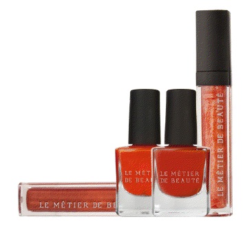
Haute Hues Summer 2012 Collection for Le Métier de Beauté. OK - we're all thinking months ahead now. I want to show you the beautiful new Lip Crème shades - live and in person.
“There is just something about the seasons mingling, when the nights begin to cool and the dog days of summer have gone to rest – bronzed skin lingers, but the shades of fall make their debut,” explains Ken Downing, Neiman Marcus’ Fashion Director. “It always brings me back to that Bianca Jagger, 1970’s Halston moment. It wasn’t just the clothing, it wasn’t just the makeup, it was how it all came together, so carefree, bohemian, and easy. That is Indian Summer.”
Ken Downing’s Indian Summer hues evoke the warm, dreamy feel of the end
of the season. Ginger Snap Lip Crème (the lighter of the two
shades) holds the perfect amount of shimmer to make lips glisten in the
sun, and when layered with the deeper bronze tones of Copper Leaf Lip
Crème (the darker shade), the effect is pure summer.
I was limited in photo time today, so I tried something new. There I was at a client site, a government installation that is so secure, I have to badge in four times before I can get to my desk. I decided to go out at lunchtime and take photos. I suspect they frown on photo taking because of the antennae installation located at the site for intelligence purposes. I tried to make it obvious, for anyone who might have seen me, that my camera was pointed at the grass and my arm, with a lovely Juniper in the background. I know someone saw me, and I can only guess what they were thinking. Poor dear finds her arm interesting. We're paying her what?
I'm sorry my photo of the glosses in their Haute Hues floral cardboard "nest" is a bit dark. The sun was partially obscured by clouds when I took it. If you would like to see the Le Métier de Beauté press photos, just hop over to my coming attraction feature.
Ginger Snap is extremely light and transparent - much lighter than I anticipated when I checked it out in the tube. It's shown at the top of my arm in the swatch photos. It's a beautiful shade - just not very pigmented. Hopefully, you can see in the photo above that it shimmers.
On the other hand, Copper Leaf is very pigmented, a burnt orange-copper hybrid. It offers a serious pop of color and will look stunning on anyone who can carry off its extremely warm shade. I'm not sure about me yet. I may layer the two to tone down the bright orange shade. I'll admit I haven't had enough time to play with it.
What do you think? Is this limited-edition set in your future? You cannot purchase these shades individually. The set costs $65, a discount over the normal price of two Lip Crèmes.
The Ken Downing for Le Métier de Beauté "capsule collections" (this is the most recent) are available at exclusively at Neiman Marcus, neimanmarcus.com, Bergdorf Goodman, and bergdorfgoodman.com. I purchased mine at Neiman Marcus. If you would like to call a product specialist, try Lisa Corsino at (703) 761-1600. Ask for the counter. When I was in New York on Saturday, the collection had not arrived at the Le Métier de Beauté counter.
Photos by Best Things in Beauty
“There is just something about the seasons mingling, when the nights begin to cool and the dog days of summer have gone to rest – bronzed skin lingers, but the shades of fall make their debut,” explains Ken Downing, Neiman Marcus’ Fashion Director. “It always brings me back to that Bianca Jagger, 1970’s Halston moment. It wasn’t just the clothing, it wasn’t just the makeup, it was how it all came together, so carefree, bohemian, and easy. That is Indian Summer.”
This sultry mix was the inspiration for Ken Downing’s summer collection
with Le Métier de Beauté, Indian Summer. “A summer dress with tawny,
coral makeup – it’s so simple and perfect,” says Mr. Downing. “Shades
of bronze, orange, gold, they look gorgeous on every woman and every
skin tone.”
I was limited in photo time today, so I tried something new. There I was at a client site, a government installation that is so secure, I have to badge in four times before I can get to my desk. I decided to go out at lunchtime and take photos. I suspect they frown on photo taking because of the antennae installation located at the site for intelligence purposes. I tried to make it obvious, for anyone who might have seen me, that my camera was pointed at the grass and my arm, with a lovely Juniper in the background. I know someone saw me, and I can only guess what they were thinking. Poor dear finds her arm interesting. We're paying her what?
I'm sorry my photo of the glosses in their Haute Hues floral cardboard "nest" is a bit dark. The sun was partially obscured by clouds when I took it. If you would like to see the Le Métier de Beauté press photos, just hop over to my coming attraction feature.
Ginger Snap is extremely light and transparent - much lighter than I anticipated when I checked it out in the tube. It's shown at the top of my arm in the swatch photos. It's a beautiful shade - just not very pigmented. Hopefully, you can see in the photo above that it shimmers.
On the other hand, Copper Leaf is very pigmented, a burnt orange-copper hybrid. It offers a serious pop of color and will look stunning on anyone who can carry off its extremely warm shade. I'm not sure about me yet. I may layer the two to tone down the bright orange shade. I'll admit I haven't had enough time to play with it.
What do you think? Is this limited-edition set in your future? You cannot purchase these shades individually. The set costs $65, a discount over the normal price of two Lip Crèmes.
The Ken Downing for Le Métier de Beauté "capsule collections" (this is the most recent) are available at exclusively at Neiman Marcus, neimanmarcus.com, Bergdorf Goodman, and bergdorfgoodman.com. I purchased mine at Neiman Marcus. If you would like to call a product specialist, try Lisa Corsino at (703) 761-1600. Ask for the counter. When I was in New York on Saturday, the collection had not arrived at the Le Métier de Beauté counter.
Photos by Best Things in Beauty
Monday, May 28, 2012
NARS Buenos Aires Velvet Gloss Pencil
With its Summer 2012 Collection, NARS introduced Buenos Aires, a Velvet Gloss Lip Pencil ($24). The glossy nude beige-pink looked pretty online, so I ordered one in April.
Moving around the globe, Buenos Aires is a wear-with-anything nude beige-pink Velvet Gloss Pencil named after the capital of Argentina. It combines the ease of a pencil with the finish of a gloss for a quintessential modern classic.
Sounded nice, right? I soured on it right away. It broke on first use. I wasn't pressing down hard when I applied it. Just normally, I thought, for a lip pencil. We got off to a bad start. It didn't get better when I examined the color on my lips. It's too light and reminds me of the nudes of yesteryear. I think it makes me look wan. I threw it in a pile of unloved makeup.
I'm finally showing it to you. Maybe this nude shade is one that will grab you. Just heed my warning. Don't press down at all when you apply the creamy pencil. Once the tip breaks off, all you can do is jam the full piece down into the pencil housing and hope you don't lose it when you remove the cap of the pencil. Yes, I know I should have returned it. With Mom needing special attention over the last few months, an e-mail to get a shipping label plus packing time didn't excite me. Plus, NARS does not refund the original shipping costs.
Here's the namby-pamby shade. This nude shade has very little pink in it. I can't figure out whether the pink I see is from my own lip pigment or the shade. It's probably me.
I wouldn't recommend this new shade from NARS. There's a place for it, but not in my house. Just a smidge more color could have made this shade a winner. Unless you are a nude lip color addict, wait for the next best thing.
Did you buy it? What do you think? If any of my contest winners wants it, just tell me in your e-mail when I notify you. It is broken and was used once, so that's not a particularly generous offer.
Photo at top courtesy of NARS; other photos by Best Things in Beauty
Moving around the globe, Buenos Aires is a wear-with-anything nude beige-pink Velvet Gloss Pencil named after the capital of Argentina. It combines the ease of a pencil with the finish of a gloss for a quintessential modern classic.
Sounded nice, right? I soured on it right away. It broke on first use. I wasn't pressing down hard when I applied it. Just normally, I thought, for a lip pencil. We got off to a bad start. It didn't get better when I examined the color on my lips. It's too light and reminds me of the nudes of yesteryear. I think it makes me look wan. I threw it in a pile of unloved makeup.
I'm finally showing it to you. Maybe this nude shade is one that will grab you. Just heed my warning. Don't press down at all when you apply the creamy pencil. Once the tip breaks off, all you can do is jam the full piece down into the pencil housing and hope you don't lose it when you remove the cap of the pencil. Yes, I know I should have returned it. With Mom needing special attention over the last few months, an e-mail to get a shipping label plus packing time didn't excite me. Plus, NARS does not refund the original shipping costs.
Here's the namby-pamby shade. This nude shade has very little pink in it. I can't figure out whether the pink I see is from my own lip pigment or the shade. It's probably me.
Did you buy it? What do you think? If any of my contest winners wants it, just tell me in your e-mail when I notify you. It is broken and was used once, so that's not a particularly generous offer.
Photo at top courtesy of NARS; other photos by Best Things in Beauty
Labels:
Charlestongirl,
Lip Color,
NARS Makeup,
Summer 2012
Monday, May 14, 2012
Coming Attraction: Le Métier de Beauté Indian Summer Collection by Ken Downing for Summer 2012
Just when summer seems to be winding down, there it is again, making a final attempt to keep the temperatures up and the days from getting shorter. Indian Summer, when summer and fall meet for a brief, but gorgeous, moment is the inspiration for Ken Downing's Indian Summer Haute Hues Summer 2012 Collection for Le Métier de Beauté.
“There is just something about the seasons mingling, when the nights begin to cool and the dog days of summer have gone to rest – bronzed skin lingers, but the shades of fall make their debut,” explains Ken Downing, Neiman Marcus’ Fashion Director. “It always brings me back to that Bianca Jagger, 1970’s Halston moment. It wasn’t just the clothing, it wasn’t just the makeup, it was how it all came together, so carefree, bohemian, and easy. That is Indian Summer.”
This sultry mix is the inspiration for Ken Downing’s summer collection with Le Métier de Beauté, Indian Summer. “A summer dress with tawny, coral makeup – it’s so simple and perfect,” says Mr. Downing. “Shades of bronze, orange, gold, they look gorgeous on every woman and every skin tone.”
Ken Downing’s Indian Summer hues evoke the warm, dreamy feel of the end of the season. Ginger Snap Lip Crème ($36 - the lighter of the two shades) holds the perfect amount of shimmer to make lips glisten in the sun, and when layered with the deeper bronze tones of Copper Leaf Lip Crème ($36), the effect is pure summer. To complete the look, coat your fingers and toes in Penny Lane Nail Lacquer ($18), a bold burnt orange reminiscent of the dark skin tones of women sun bathing in Ibiza, or drench your nails in the brighter-than-bright Wild Ginger Nail Lacquer to liven up a sleepy July afternoon.
Ken Downing for Le Métier de Beauté "capsule collections" are available at exclusively at Neiman Marcus, neimanmarcus.com, Bergdorf Goodman, and bergdorfgoodman.com. Look for this collection to appear as summer gets it start - coming soon.
Photo courtesy of Le Métier de Beauté
Labels:
Charlestongirl,
Le Métier de Beauté,
Lip Color,
Lip Gloss,
Nails,
Summer 2012
Thursday, May 10, 2012
New: Chantecaille Cheek Crème
Achieve a natural summer color with Chantecaille’s new, luxurious Cheek Crème ($34). Each of the three flattering shades (Shy, Demure, and Coy) contains unique "siliconic elasomers" in emollient oils with luminous results. The compact’s mirror guarantees effortless application on-the-go, making it this summer’s beach bag essential if you're headed out of town. For me, two of these shades will be parked firmly on my bathroom counter.
When I first saw the "portrait" of these beautiful cream blushes, I knew I needed the two pink shades. I wasn't sure about the warm, peachy shade, but my curiosity ruled. I ordered all three.
Here they are lined up at my house. As with Akoya Pearl, I was limited by a miffy sun. I did the best I could with photos. I placed the pretty little round compacts in the following order: Demure, Coy, and Shy are shown left to right directly above.
I swatched them extremely heavily using a sponge-tipped applicator - an application method one would never use "in real life." I wanted to show you the color differences and decided that was the best way to do it. All swatch photos show Demure at the top of my arm, Coy in the middle, and Shy at the bottom.
This first swatch photo, taken in front of a Satsuki azalea that has just started to show off its multicolored flowers, shows the colors well. Demure is for gals who need a warm tone and love peach. It's very pretty on the cheeks when applied with a foundation brush or even my fingertips. It warms my face and makes me look ready for a summer day.
Coy is rose, but I think it leans coral. Does that make sense? Let's call it a warm rose. Shy is the pink at the bottom of my arm. How good does it get? If I were going to choose a shade - only one - for my fair, cool-toned complexion, Shy would be the it shade. It's a gorgeous pink.
Poised in front of a miniature rose, the colors look the same. You'll note that they are not sparkly or shimmery. They provide a creamy gleam to my cheeks and look very natural. Chantecaille actually recommends that we apply them with our fingertips, dotting the color onto the cheeks and then blending lightly. That works nicely (the formula offers nice slip), but I like using my foundation brush better.
These velvety, soft, and easily blendable colors definitely melt into the skin for a pretty anytime glow - fresh and natural. The white lily bulb and peach extracts in the formula will shield our delicate faces from free radicals. Chantecaille always puts beneficial ingredients into its color, offering "the whole package" with each luxurious new product.
I'll leave you with one more swatch photo before I run off to work. Remember, the shades were applied unrealistically heavily for these blushes. Still, there's a lot of color in each them. If you decide to use the fingertip dot-and-blend method of application, dot very lightly to ensure you get the right amount of color. It won't take much to make you look pretty.
The new Cheek Crèmes are available at Chantecaille's Web site, where I purchased mine. I saw all three shades on the Summer 2012 display at Neiman Marcus, so you ought to be able to find them at your favorite Chantecaille counter. The Summer 2012 Collection has arrived!
Photos at top and bottom courtesy of Chantecaille; other photos by Best Things in Beauty
Labels:
Chantecaille,
Charlestongirl,
Cream Blush,
Summer 2012
Wednesday, May 9, 2012
New: Chantecaille Poudre de Perle in Akoya Pearl for Summer 2012
Steady my heart, Chantecaille's Poudre de Perle in Akoya Pearl ($58) is even better than I expected - and I always have unparalleled expectations for Chantecaille. They set the bar high for their competitors.
Created exclusively for Christopher Kane's Spring/Summer 2012 runway models, Poudre de Perle in Akoya Pearl is a bright rose-pink color that creates a fresh, windswept flush on any complexion. The rosy pink shade looks cheerful.
Prior shades of Poudre de Perle have delivered an innovative all-over highlighting formula. Akoya Pearl is a blush - an exquisite brush. Like its sisters, it arrives with its own brush (unless you buy just the refill) and delivers the perfect amount of luminosity to all skin tones. The smart formula replaces traditional talc particles with weightless, silky, and translucent optics that ensure skin clarity and luminosity. Particles of zinc, iron, and mica provide mineral content to calm our sensitive skin and fortify it from environmental elements.
Now for the color! How many superlatives can I string together into one sentence? Just let me gush and get on with it. I'll admit that I had some worries that Akoya Pearl might be too bold a color for my skin when I first saw its photo. I should have known it would be perfect.
I took my photos in sunlight that could have been brighter. Basically, I took what I could get. With high clouds, it was bright outside between periods of rain, so I ran outside and started snapping. I applied Akoya Perle with its own brush - heavily so that you could see the color. Had I applied it the way I apply it on my cheeks, my photos wouldn't have worked well for a blog.
With this heavy application, you can see the gorgeous color on my arm. It's an uneven swatch (hey, I was racing clouds!), but now that I have the brush primed and ready to roll (not always easy at first), the blush will apply evenly.
The pink powder is "just on the cool side" of a warm pink. I suppose that makes it a neutral pink. That's why it will look great on nearly all complexions, but the term "neutral pink" sounds boring. Akoya Pearl is anything but boring. It adds radiant pink color to my cheeks and makes me look happy and perky. It doesn't get better than that.
Poudre de Perle in Akoya Pearl is available at Chantecaille's Web site, where I purchased mine. I looked for it on the new Summer 2012 display at Neiman Marcus, but the tester was missing. There was no one staffing the counter, so I don't know whether they have it yet. You have to try this one! If you delay too long, I'll bet it will sell out. That's excruciating for beauty lovers.
In the morning, I'll show you the equally exquisite new cream blushers from Chantecaille. Wow! I purchased all three.
Photo at top courtesy of Chantecaille; other photos by Best Things in Beauty
Labels:
Blush,
Chantecaille,
Charlestongirl,
Summer 2012
Subscribe to:
Posts (Atom)