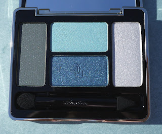
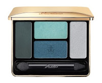
 I had two choices of color harmonies in Guerlain's Écrin 4 Couleurs Long-Lasting Eyeshadows ($59) for Spring 2012: #12 Les Aqua and #11 Les Rose. Which one would you have selected? For me, Les Aqua reached out and grabbed me. If you'd like to see a preview photo of Les Rose, click here.
Each harmony of Ecrin 4 Couleurs is composed of an interplay of four different and specially selected textures to allow you to mix and match to define your own look. There are two new permanent shades, which will be good news for all of you who are worn out by holiday shopping.
Les Aqu
 a (#12) will create a sophisticated and stunning gaze in shades of the water on a pristine beach. This palette mixes an iridescent blue with matte navy, a velvety turquoise, and a glacier metallic ice. A few of these are are hard colors for me to wear (in my conservative opinion). I have to apply them lightly and use them as accents. Nevertheless, I couldn't leave them at Neiman Marcus; they were too pretty. They had to come home with me to play.
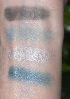
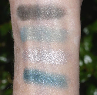
I took my swatch photos in full sun. I applied the shades heavily with a sponge-tipped applicator, swatching clockwise, starting with the matte "navy-charcoal" shade at the left in the palette at the top of my arm.
 It was hard for me to see in the pan and on my skin that the darkest shade is navy. To me, it appears to be charcoal. Let's call it a navy-leaning charcoal. The robin's egg blue has some green in it, but I'll admit that the first time I swatched it, my thoughts went straight to those supremely beautiful, fragile eggs.
The glacial color is a stunning, shimmering silver. Guerlain calls it blue, but I don't see blue in it until I hold it next to something blue. I put some on my fingertip, held it against the blue slacks I was wearing, and I "saw" a blue cast - either that or it was the power of my imagination. I actually love the shade and think I'll wear it more often than all the others. It applies evenly, which I appreciate. That's not always true with silvers.
 The shade that looks truly blue in the pan is instead an incredibly gorgeous teal blue. This is one of those steady-my-heart shades that I will find a way to wear. Where is my favorite Guerlain makeup artist when I need her? While the shade may be limited to this "living in taupe" gal, I just made a resolution to wear the blue - even if I look like a peacock. At times like this, I have serious dark-skin envy.
The finishes range from the matte charcoal (navy) through a light velvet blue to shimmering silver and teal. The range is lovely. As I'm sure you Guerlain fans know, the texture of their powder eye shadows is divine, and the compacts (gold in this case, with a mirror inside) are luxurious and heavy in the hand. A dual-ended sponge-tipped applicator is included in the compact for those who take their shadows along.
While seeking out the Météorites Cruel Gardenia Illuminating Iridescent Powder, which I know you are all doing, take a look at the pretty new eye shadows. In addition to the two new Écrin 4 Couleurs Long-Lasting Eyeshadows, there is a Écrin 6 Couleurs Eyeshadow Palettes that you saw in my spring preview.
I purchased my new Guerlain for Spring 2012 from The Pinks and the Blacks Collection at Neiman Marcus. Your Guerlain counter should have the collection soon if it doesn't already. Even my local store had not yet received the new pink Rouge G colors, although they did receive Noir G de Guerlain Mascara a few days before it was scheduled to arrive.
Note: While the original publicity named this palette "Les Aquas," the palette itself and the box proclaim its name as "Les Aqua."
Second photo by Guerlain; other photos by Best Things in Beauty


11 comments:
I have they same quad. Well, colors are great (except of gray which seemed to me dirty or even dusty, with bad color payoff). I've reviewed this some time ago and found that I don't really have color dupes and blues are especially amazing.
However this palette looks pretty much the same as #10 from Guerlain Holiday collection. The colors are different of course, but the idea is quite the same. And I don't really imagine why Guerlain released two palettes that are alike one after another. If I weren't a beauty blogger I won't buy both palettes. No way.
It is true, time4beauty, that we buy things for our blogs that we might not buy otherwise. I did that over the last year, and most of the time, I was extremely happy with my purchases.
Sorry to hear you had an issue with the charcoal shade. It glommed onto my skin and stayed there. I found it very "creamy" for a powder. Must be our skin differences.
Did you buy Les Rose?
That looks really pretty. I didn't buy that particular quad because I thought it looked kind of similar to the holiday palette. Did you try any of the lipsticks and glosses? What were your thoughts?
Based on your arm swatches, Les Aquas appears to be much lighter and brighter in over all concept than the deeper, jewel toned Les Ombres de Nuit. Although I'm sure many women found occasion to wear LOdN during the day, it was obviously designed to create a dramatic evening look with its strong contrasts and juxtaposition of true sapphire and vibrant aquamarine. Les Aquas, on the other hand, appears to be a collection of cheerful, warm blues. I think you could use this quad to create a gorgeous ombré effect that would be perfect on a sunny spring day. Have fun with this one, Charlestongirl. I think you can make it work and look smashing in it!
Hi Anahita,
I bought all four glosses and just posted my feature. I have not yet purchased any of the Rouge G shades because the testers have not arrived. If and when they do, I'll decide which shades I must have. :)
No, I've skipped rose palette - I can't really wear those colors :((
I think the problem is not only with the skin. I've got several palettes from PR before they were launched in autumn. I've found few colors were really poor quality. Then few of my friends bought those palettes. And 50% found colors were nice, really not that bad as in my items, but 50% found the quality of occasional color was really bad. And you could see it already when you swatch it. You can find the post about this spring palette in my blog and you will see that gray one looks worse then the others.
Thanks, Eileen, I hope so!
I agree on the comparison to holiday. These shades are more spring-like, even summer-like.
That's too bad, time4beauty. I had no problems at all with the charcoal shade. It applies very evenly on my skin, and it stays put forever.
Thank you for the swatches. They certainly look brighter and more luminescent than in the pan. I don't think this would really work for me, though. Maybe 2 of the 4 would work, but that's not enough for me to warrant a purchase. On your beautiful blues, this will be STUNNING!
Maybe, maybe not, Lovethescents. They can be difficult shades. Even I'll have a little trouble wearing them. A light hand and the right technique should work for me, though.
If anybody can do it, you can!
Post a Comment